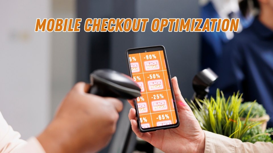
Mobile checkout optimization is the highest leverage growth tactic most ecommerce stores are still ignoring. Smartphones now generate roughly 69% of all global online shopping orders according to Statista’s 2025 mobile commerce report, yet the average mobile conversion rate sits between just 1.5% and 1.8%. Desktop converts at nearly double that rate. The gap is not caused by technology limitations. It is caused by poor design decisions, and every one of them is fixable.
This guide walks you through seven research backed strategies for optimizing your mobile checkout experience, complete with real brand case studies, verifiable data, and step by step implementation advice. Whether you run a Shopify store doing six figures or manage checkout flows for a large enterprise retailer, these tactics apply directly to your bottom line.
Related reading: How to Reduce Cart Abandonment With Email Recovery Sequences | Ecommerce UX Audit Checklist for 2025
Table of Contents
What Is Mobile Checkout Optimization?
Mobile checkout optimization is the process of eliminating friction, reducing steps, and improving every element of the purchase experience for shoppers buying on smartphones and tablets. It spans form field design, payment method selection, page load speed, trust signal placement, and post purchase account creation flows.
The goal is straightforward: make it effortless for someone holding a phone in one hand to move from product interest to completed purchase without encountering confusion, delays, or doubt.
Why Mobile Checkout Optimization Matters More Than Ever
Most of your ecommerce revenue is leaking out through mobile. The numbers make this painfully clear.
Baymard Institute’s aggregated research across 50 independent studies puts the average online cart abandonment rate at 70.22%. On mobile devices specifically, that rate climbs to approximately 85.65%, as documented by Amra and Elma’s 2025 mobile commerce analysis. For every 100 mobile shoppers who add something to their cart, fewer than 15 finish buying.
The financial scale is staggering. Baymard estimates that approximately $260 billion in recoverable orders are lost annually across US and EU markets, purely due to fixable checkout usability problems. Mobile devices now generate around 75% of all retail website visits according to multiple industry benchmarks. When enormous traffic volume meets extremely low conversion rates, the revenue left on the table becomes the single largest untapped growth opportunity for most stores.
Walmart Canada proved this firsthand. After investing in a full responsive redesign focused on mobile usability, they saw a 20% increase in overall conversions and a 98% jump in mobile orders. The project paid for itself within months.
<!– IMAGE SUGGESTION: Custom infographic showing the mobile vs desktop conversion gap with key stats from the table below. Alt text: “Infographic comparing mobile checkout conversion rates versus desktop, showing mobile at 1.5% to 1.8% and desktop at 3.36%” –>
Key Mobile Commerce Benchmarks
| Metric | Value | Source |
| Average mobile cart abandonment rate | ~85.65% | Amra and Elma, 2025 |
| Average desktop cart abandonment rate | ~73% | Baymard Institute |
| Average mobile conversion rate | 1.5% to 1.8% | Salesforce Commerce Cloud / Littledata |
| Average desktop conversion rate | ~3.36% | Salesforce Commerce Cloud |
| Potential conversion lift from checkout redesign | Up to 35.26% | Baymard Institute |
| Share of ecommerce traffic from mobile | ~75% | Industry aggregate data |
Top Reasons Shoppers Abandon Mobile Checkouts
Before optimizing anything, you need to diagnose the specific friction points causing mobile shoppers to leave. Baymard Institute’s survey on cart abandonment reasons identifies these top causes (excluding the “just browsing” segment):
- Unexpected extra costs at checkout (shipping, taxes, fees): ~48% of abandoners
- Forced account creation before purchasing: ~24% to 26%
- Checkout process too long or complicated: ~18% to 22%
- Concerns about payment security: ~17% to 19%
- Slow website or page load issues: ~13%
On mobile, every one of these friction points hits harder. Filling out forms on a compact mobile display feels slow and often leads to input mistakes. Surprise costs feel more jarring when limited screen space hides the total until the final step. And slow pages test patience far more aggressively on a phone than on a desktop with a wired connection.
Google’s mobile research has consistently shown that 53% of mobile visitors will abandon a page that takes longer than three seconds to load. When that page is your checkout, every additional second of delay translates directly into lost revenue.
Related reading: Payment Gateway Comparison: Which Is Best for Mobile Conversions?
<!– IMAGE SUGGESTION: Bar chart showing the 5 abandonment reasons with percentages. Alt text: “Bar chart showing top 5 mobile checkout abandonment reasons including unexpected costs at 48%, forced account creation at 24%, and complicated checkout at 22%” –>
Strategy #1: Slash the Number of Form Fields
The fastest path to higher mobile conversions is reducing how much you ask shoppers to type. The average ecommerce checkout contains roughly 11 to 15 form elements according to Baymard Institute’s checkout usability benchmarks. Their research shows an optimized flow can function with as few as 7 to 8 input fields.
Every extra field on a mobile screen raises abandonment risk. Thumbs are imprecise. Autocorrect introduces errors. Each additional tap gives the shopper another moment to reconsider the purchase entirely.
How to Reduce Form Friction Step by Step
- Enable address autocomplete using Google Places API or a similar service. One selection fills city, state, and zip code, saving significant typing effort.
- Combine first and last name into a single field where feasible. Two separate name fields on a 6 inch screen feel unnecessarily tedious to most shoppers.
- Default billing address to match shipping address. The majority of shoppers use the same address for both. A simple toggle eliminates an entire duplicate form section.
- Hide optional fields behind an expandable link. Optional fields such as ‘Company Name’ or ‘Address Line 2’ should stay hidden unless the shopper taps a link like ‘Add more details’ to reveal them.
- Trigger smart keyboard types automatically. Show a numeric keypad for phone number and card fields. Show an email optimized keyboard for the email field. This small detail reduces typos and speeds up input noticeably.
Swell Commerce’s analysis of checkout benchmarks found that stores trimming their forms to 7 fields or fewer achieved significantly higher completion rates than those using the industry average of nearly 15 fields.
Real world proof: A Kozak Group case study documented a brand that reduced checkout abandonment from 64% down to 42% by simplifying web forms, introducing a single page checkout with clearly stated delivery details, and adding a persistent add to cart button for mobile users. That 22 percentage point drop translated directly into higher revenue.
Strategy #2: Make Guest Checkout the Default Path
Requiring account creation before purchase is one of the most destructive conversion killers in ecommerce. Baymard’s research shows roughly 24% of shoppers abandon specifically because a site demanded they create an account first.
On mobile, this friction multiplies. Nobody wants to invent a password, verify an email, and navigate account setup screens on a small display while standing in a checkout line or sitting on a bus. The fix is simple: let people buy first, then offer account creation after the order is confirmed.
Implementing Guest Checkout the Right Way
- Position guest checkout as the primary and most visible option on your checkout entry screen. Never bury it below the login form.
- On the order confirmation page, display a single password field inviting the customer to save their account. You already have their name, email, and address, so registration becomes a one tap action rather than a multi screen ordeal.
- For returning visitors, use cookie based recognition to auto populate their email and surface a quick login prompt, but never block the checkout path if they skip it.
Shopify reports that their Shop Pay express checkout feature converts at rates up to 50% higher than standard guest checkout flows. And ASOS famously saw a 50% increase in completed checkouts simply by adding a prominent guest checkout option alongside their existing login form.
Related reading: Post Purchase Account Creation: How to Build Customer Profiles Without Blocking Checkout
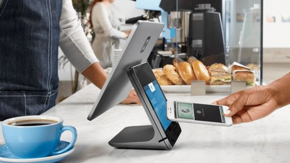
Strategy #3: Prioritize Digital Wallets and One Tap Payments
Moving digital wallet options like Apple Pay, Google Pay, and PayPal to the very top of the checkout screen is often the single highest impact change a store can make overnight. These methods eliminate the need for shoppers to type card numbers, expiry dates, CVV codes, and billing addresses. One biometric scan or a single tap, and the payment is done.
Statista reports that digital mobile wallets now represent the leading online payment method in the United States, used by 37% of online shoppers, surpassing traditional credit cards. Research indicates that nearly 30% of consumers plan to use three or more digital wallets in the near future.
Stores adding Apple Pay to their mobile checkout commonly report a 10% to 15% uplift in mobile conversion rates, depending on the share of iOS traffic and how prominently the option is displayed. One click checkout solutions more broadly have been linked to a 28.5% increase in average mobile spending, according to Cornell University research cited in Customcy’s mobile commerce data roundup.
Best Practices for Payment Method Display
- Place express payment buttons at the very top of checkout, before any form fields. Shoppers who see Apple Pay or Google Pay immediately may never need to scroll further.
- Never bury digital wallets in a dropdown or at the bottom of a long list. If shoppers have to search for their preferred method, you have already lost a percentage of them.
- Support Buy Now, Pay Later (BNPL) options. Industry data suggests BNPL can improve checkout conversion by up to 78% for certain demographics while reducing cart abandonment by approximately 10%.
- Show payment method icons prominently. Familiar logos (Visa, Mastercard, PayPal, Apple Pay) provide instant subconscious reassurance about security.
<!– IMAGE SUGGESTION: Side by side screenshot comparison of a checkout with wallets buried vs. wallets at the top. Alt text: “Comparison of two mobile checkout screens showing digital wallet placement at top versus bottom, illustrating best practice for Apple Pay and Google Pay button positioning” –>
Strategy #4: Make Page Speed a Non Negotiable Priority
A slow mobile checkout page is a direct revenue leak. Google’s landmark mobile research found that when page load time increases from one second to three seconds, bounce probability jumps by 32%. At five seconds, bounce probability skyrockets by 90%.
Analysis from Yottaa’s 2025 Web Performance Index, which examined over 500 million visits across 1,300+ ecommerce sites, found that saving just one second on mobile load time increases conversions by roughly 3% on average. A Portent study reinforced this, showing that sites loading within one second convert at 2.5 times the rate of sites loading in five seconds.
Real world proof: Vodafone ran an A/B test measuring the impact of optimized Web Vitals and found that a 31% improvement in Largest Contentful Paint (LCP) produced a 15% improvement in lead to visit rate, an 11% lift in cart to visit rate, and 8% more completed sales.
Quick Wins for Faster Mobile Checkout Pages
- Compress all images to WebP format. Unoptimized images remain the number one speed killer on mobile retail sites. WebP files are significantly lighter than JPEG or PNG without visible quality loss.
- Minimize third party scripts. Every analytics pixel, chat widget, and retargeting tag adds latency. Audit your checkout page and remove anything that does not directly support the purchase flow.
- Implement lazy loading. Load only above the fold content first and defer everything else. This makes the checkout feel instant even on slower mobile connections.
- Use a content delivery network (CDN). Serving assets from a geographically close server reduces latency, especially for international shoppers.
- Test on real mid range devices. Your customers are not all using flagship phones. Google Lighthouse and Chrome DevTools both simulate slower devices and 3G connections.
Target a checkout page that loads in under two seconds on a 4G connection. Anything above three seconds means you are losing a measurable percentage of mobile buyers.
Related reading: Core Web Vitals for Ecommerce: A Practical Optimization Guide
Strategy #5: Layer Trust Signals Throughout the Checkout
Mobile shoppers hand over sensitive payment details on a small screen, often in public spaces. Any hint of doubt about security triggers an immediate exit. Approximately 17% to 19% of cart abandonments stem from payment security concerns, per Baymard Institute’s abandonment research.
Trust is not built with a single badge. It is constructed through multiple reinforcing signals placed at every decision point throughout the checkout flow.
Where to Place Trust Signals for Maximum Impact
- Display SSL indicators and security badges (Norton Secured, McAfee, or your payment processor’s logo) directly adjacent to the payment form fields where shoppers enter card information.
- Show accepted payment method icons prominently. Familiar logos (Visa, Mastercard, PayPal, Apple Pay) trigger subconscious reassurance about legitimacy.
- Surface a brief return policy summary on the checkout screen. A compact line like “Free returns within 30 days, no questions asked” can dissolve last second hesitation.
- Strip away all distractions. Remove header navigation, sidebar banners, pop ups, and social media links from the checkout page. A distraction free environment inherently feels more trustworthy and keeps attention focused on completing the purchase.
- Feature compact social proof near the order summary. A star rating or brief customer review badge reinforces confidence that the shopper is making the right decision.
Real world proof: When CrazyEgg optimized Century Hearing Aids’ website by establishing trust signals, adjusting visitor flow, and optimizing traffic sources, they achieved a 220% conversion increase and a 300% revenue lift. Trust was identified as the primary bottleneck.
Conversion rate optimization research consistently shows that trust badges alone can lift checkout completion by 15% to 20% on mobile, particularly among first time customers with no prior brand relationship.
Strategy #6: Choose the Right Checkout Layout for Mobile
Single page checkouts consolidate shipping, billing, and payment into one scrollable screen. Multi step checkouts break the process into sequential stages, typically three to five screens. Both approaches work, and the best choice depends on your product complexity and audience.
For most mobile stores, a streamlined multi step layout with a visible progress indicator tends to outperform a long scrolling page. The reason is cognitive: mobile screens are small, and displaying every form field simultaneously can feel overwhelming. Breaking the flow into digestible stages (shipping, then payment, then review) reduces perceived effort and keeps the shopper focused on one task at a time.
The key is keeping each step short. Baymard’s usability benchmarks recommend 12 to 14 total form elements across all steps, with no more than 7 to 8 actual input fields. If your multi step checkout exceeds five screens, you have too many steps.
Real world proof: The Vancouver 2010 Olympic Store ran an A/B test through Elastic Path Software and found that a single page checkout outperformed their multi step flow by 21.8% for their specific product mix. Meanwhile, The Clean Program achieved a 16% conversion increase by switching to a 3 tabbed checkout layout. The takeaway: there is no universal winner. Test both formats with your audience.
Quick Comparison: Single Page vs. Multi Step
| Factor | Single Page Checkout | Multi Step Checkout |
| Best for | Simple products, few fields | Complex orders, multiple shipping options |
| Mobile UX | Can feel cluttered on small screens | Feels lighter per individual step |
| Progress visibility | Entire form visible at once | Requires a progress bar (recommended) |
| Conversion impact | Effective when total fields are minimal | Generally higher on mobile with progress indicators |
Whichever format you choose, always include a persistent order summary showing the cart total, item count, and any applied discounts. Mobile shoppers need constant reassurance about what they are buying and what they are paying.
Related reading: Single Page vs. Multi Step Checkout: Which Is Right for Your Store?
Strategy #7: Build a Structured A/B Testing Framework
No mobile checkout optimization strategy is complete without systematic testing. What lifts conversions for a fashion retailer may backfire for an electronics store. The only reliable way to know what works for your specific audience is controlled experimentation.
What to A/B Test First on Mobile Checkout
- Number of form fields (full form vs. reduced form)
- Position of digital wallet buttons (top of checkout vs. below form fields)
- Guest checkout as default vs. login as default
- CTA button text and size (e.g., “Pay Now” vs. “Complete Order” vs. “Place My Order”)
- Progress bar presence vs. no progress indicator on multi step flows
- Trust badge placement (adjacent to payment fields vs. page footer)
Segment every test by device type. A change that lifts desktop conversion may actively hurt mobile performance, or vice versa. Tools like Optimizely, VWO, and AB Tasty all support device level targeting.
Real world proof: Optimizely documented a case where changing a single button label from “Continue” to “Review Order” produced a 54% increase in funnel conversions. Another Optimizely test showed that removing the navigation menu from the checkout page increased revenue per visitor by 14%. Small, testable changes often produce outsized results.
Start with the changes most likely to generate large effects: reducing form fields, enabling guest checkout, and surfacing digital wallets. These three adjustments consistently deliver the biggest measurable lifts across industries, based on aggregated data from Baymard Institute and Swell Commerce.
Advanced Tactics: Going Beyond the Basics
Once you have implemented the core seven strategies, these additional tactics can push your mobile checkout conversion rate even higher:
- Exit intent recovery: Trigger a subtle pop up or live chat nudge when a mobile shopper pauses on the checkout page for more than 20 to 30 seconds without activity. A simple reminder or a small incentive (free shipping, 5% discount) can recapture hesitant buyers.
- Post purchase upsell and cross sell: After the order is confirmed, present a one tap add on offer on the thank you page. This captures incremental revenue without adding any pre checkout friction.
- Progressive Web App (PWA) checkout: Alibaba’s PWA implementation generated a 76% increase in total conversions, and Debenhams saw a 40% rise in mobile revenue after adopting PWA technology.
- Session saving across devices: Allow shoppers to start checkout on mobile and finish on desktop (or vice versa) by persisting cart state across devices through account sync or email recovery links.
- Localized payment methods: For international stores, displaying region specific payment options (iDEAL in the Netherlands, Klarna in Scandinavia, UPI in India) can significantly improve trust and completion rates.
Related reading: Exit Intent Strategies That Actually Work on Mobile | How to Build a Mobile Checkout Recovery Funnel
Conclusion: Every Tap on Mobile Either Builds or Breaks Revenue
Mobile checkout optimization is not a one time project. It is an ongoing discipline that directly determines how much of your traffic converts into actual revenue. The data leaves no room for ambiguity: mobile generates the majority of ecommerce visits but converts at less than half the desktop rate. That gap represents an enormous and largely untapped financial opportunity.
The seven strategies in this guide, from reducing form fields and enabling guest checkout to prioritizing digital wallets, accelerating page speed, layering trust signals, choosing the right checkout layout, and building a systematic testing framework, are not theoretical ideas. They are grounded in extensive research from Baymard Institute, Google, and Salesforce, and validated by real world results from brands like Walmart Canada (98% mobile order increase), ASOS (50% more completed checkouts), and Vodafone (8% more sales from speed optimization alone).
Start with the highest impact changes. Reduce unnecessary form fields. Move Apple Pay and Google Pay to the top of your checkout screen. Make guest checkout the default. Then measure, test, and iterate relentlessly. Even a 0.5% improvement in mobile checkout conversion rate translates into significant revenue when applied across the traffic volume your store already receives.
If this guide helped you identify your next optimization priority, share it with your team or bookmark it as a reference. Tested a mobile checkout tactic that produced surprising results? Drop a comment below. The best optimization insights come from practitioners in the trenches, not from textbooks.
Frequently Asked Questions About Mobile Checkout Optimization
What is mobile checkout optimization?
Mobile checkout optimization is the practice of improving every element of the purchase completion process on smartphones and tablets. It involves reducing form fields, accelerating page load times, offering express payment options like Apple Pay and Google Pay, and systematically removing friction points that cause shoppers to abandon their carts before finishing a transaction.
What is a good mobile checkout conversion rate?
A typical mobile ecommerce conversion rate falls between 1.5% and 2%, based on data from Salesforce Commerce Cloud and Littledata. Top performing stores that invest in systematic mobile checkout improvements regularly achieve conversion rates above 3%, which is roughly double the industry average and closer to desktop performance levels.
Why is mobile cart abandonment so much higher than desktop?
Mobile cart abandonment rates hover near 85%, compared to approximately 73% on desktop. The gap exists because small screens make form filling tedious and error prone, slow load times test patience more severely on cellular connections, and shoppers often browse mobile with lower immediate purchase intent. Forced account creation and surprise costs amplify these issues further on compact displays.
How many form fields should a mobile checkout have?
Research from Baymard Institute recommends that an optimized mobile checkout contain no more than 7 to 8 input fields, or roughly 12 to 14 total form elements including dropdowns and toggles. The average ecommerce site still uses nearly 15 fields, which exceeds what is necessary and directly increases abandonment rates.
Do digital wallets like Apple Pay actually improve mobile conversions?
Yes, significantly. Stores that enable Apple Pay, Google Pay, or similar one tap payment methods on mobile consistently report a 10% to 15% increase in mobile conversion rates. These options remove the need to type card numbers, billing addresses, and expiry dates, eliminating the single largest friction source on touchscreen devices.
How does page speed affect mobile checkout conversions?
Page speed has a direct, measurable impact on mobile checkout performance. Google’s research demonstrates that bounce probability rises by 32% when load time increases from one to three seconds. Industry benchmarks recommend targeting a mobile checkout load time under two seconds on 4G connections, as each additional second of delay can reduce conversions by approximately 3% to 7%.
What is the best checkout layout for mobile: single page or multi step?
There is no universal answer. Multi step checkouts with visible progress indicators tend to perform better on mobile for stores with complex product options, while single page checkouts can outperform for simple, low field purchases. The only reliable way to determine what works best for your audience is A/B testing both layouts with device level segmentation.